04 Sep Designing a Combined Specialty Dental Practice
In a dual specialty practice, it is important to consider each specialty’s unique and shared needs to maintain a functional and seamless balance. This design considers the entire office and the individual spaces to maximize efficiency and the patient and staff experiences within. Since both specialties often have multiple guests accompanying the patient, whether a parent or sibling, the design also provides additional seating spaces throughout.

PUBLIC ZONE
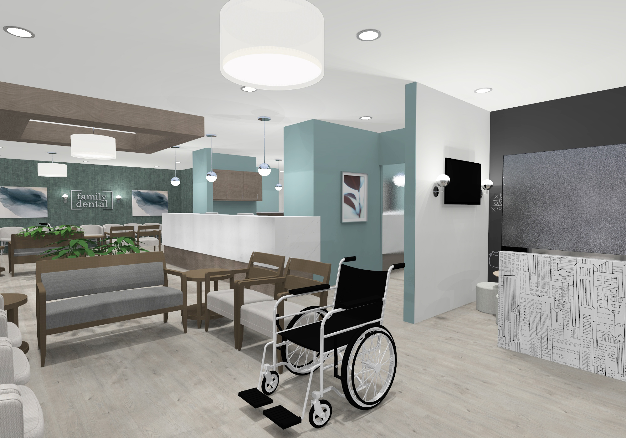
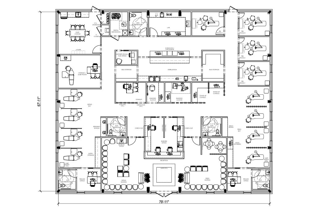
A centrally-placed reception desk greets patients as they walk in, with separate waiting spaces to either side. To the left is the orthodontic waiting and to the right is the pediatric-focused seating with an adjacent kids’ area. These front-office spaces act almost like two separate clinics with individual entrances to the specialty-specific treatment spaces and a patient restroom just around the corner for easy access. Each side of the business office also has its own check-out space for end-of-visit processes like re-appointment.

CLINICAL ZONE
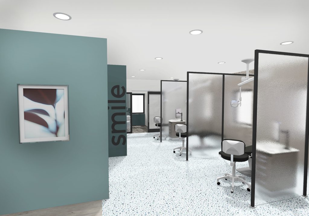
As mentioned, these specialties have separate treatment areas. Both the orthodontic and pediatric chairs are arranged in a straight bay with partitions between chairs for enhanced privacy. There is also guest seating at the toe of each chair. On the pediatric side, there is a combination of quiet and consultation room for more advanced care or treatment planning. On the orthodontic side beyond the bay are four closed treatment rooms. These could also be used for pediatric patients requiring enhanced privacy.
The office comes back together in the support spaces located centrally within the office. Positioned just behind reception along the clinical entrance are two imaging alcoves. Separating these imaging units within their own alcove allows for multiple patients to have their scans taken at once. The two different units also support different needs, so it may be that one patient may not need to jump in each alcove for every visit. This prevents bottle-necking between the two workflows of each specialty. On either side of the alcoves are consultation spaces. The left is a traditional set-up and more suitable for longer treatment planning conversations, but more specifically for young patients who may need to be focused and contained within a quiet room. To the right are two semi-private standing consultation touch-points ideal for quick conversations like home care or follow-up appointments for orthodontic patients.
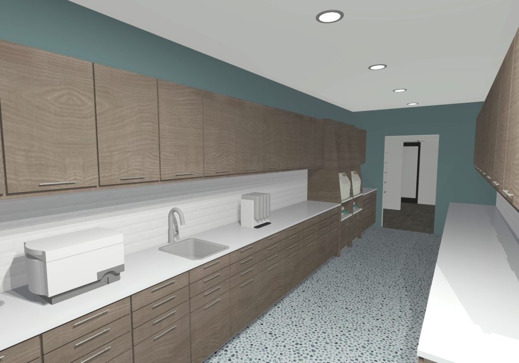
The sterilization center is also shared with multiple access points for efficient flow to and from each treatment space. On both the right and left sides of the office, staff can pass through bulk storage rooms. Along the back hall, there are two more entrances for a more traditional in-and-out flow from dirty to clean and a large counter with storage opportunities sits between these openings for convenient procedure preparation. Along the hall are two staff workstations with card docking beneath. This hall is not as patient-centric so it is ideal for a brief catch-up space for staff to enter and review patient notes and as a space for ordering and maintaining supplies within the bulk storage spaces. Across from this large sterilization run is a sizable lab.


PRIVATE ZONE
The remainder of this back hall is for team spaces such as the staff lounge, restroom, and small flex space that also functions as a mother’s room. This space could be used as a private workspace, call center, or changing room, if necessary.
The private offices are located at the front of the practice at the end of each treatment bay for easy access and monitoring of treatment. They each also contain a private restroom.

