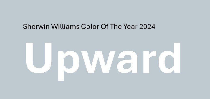
Designing with the Sherwin Williams Color of the Year 2024

Each year, leading companies in the paint industry release a trending color of the year. At Sherwin-Williams, this involves working with a global team of esteemed color and design leaders to select the annual forecasted trend. Our designers were excited to see this year’s release of Upward, a breezy, relaxed blue with a perfect balance between color and neutrality. See below how each designer created a design with this color at the forefront. 

Design by Kaitlyn Hegewald & Rachel LeDuc

Leaning on the Natural

The airyness of the Upward color lends itself to a very natural, tonal palette with warm browns, soft greens, and light woods. The designer utilized a wood look for both the floor and vertical cabinetry. Paired with a floral linework wallcovering, the environment is a breath of fresh air. 

Design by Leah Wolters

Bright Pop for Pediatrics

Leah Wolters was inspired by the bright nature of this paint and found the perfect wallcovering to compliment. The wallcovering featured behind the imaging unit informed the rest of the space with deep browns, creams, and a green accent. Mixed with a non-traditional blue, textural floor, this palette is still subtle with a hint of fun perfect for younger patients. 

Design by Grace Schneider

Soothing Pastels

Carrying on with the pastels, Grace paired Upward with a light lavender for a soft feminine touch. The graphics of the wood-look luxury vinyl plank elevate the palette for a dynamic look. Textural wallcovering and carpet add dimension in the airy space. 

Design by Robyn Connors & Christy Ann Mazurek

Creative Contrasting

In a similar vein, this design dives into a natural palette, but with dark contrasting colors for a deep, woodsy look. The dark wallcovering and deep green accent highlight Upward like a clear blue sky. The resing panels with reed-like texture provide privacy and shelter like tall grasses. Bone whites and light wood-look floors continue the contrast and alleviate any heaviness with the deep focal walls. 

Design by Rachel LeDuc

Calming Neutrals

Rachel accented Upward with soft browns and creams for a calming neutral palette. The large-scale textural wallcovering provides interest and dimension. Looking through the glass from consult, it looks almost like framed artwork. The blue-linen laminate of the vertical cabinetry complements the accent paint for a seamless look. 

Design by Renee Susami & Lisa Loch

Artsy Gem Tones

Reminiscent of a 70s color palette, this design plays with deep gem tones for a bold, artsy look. Black and white prints pop off the deep wall, with the Upward accent wall providing a slight reprieve. The waterfall counter and light-tone wood floor modernize this look. The overall look is bold with a hint of eclectic charm. 

Design by Cindi Matt & Leah Wolters

Beautiful Blues

In this monochromatic palette, the blues take charge in creating a consistent feel throughout the space. Upward acts as the main paint with a deep blue accenting for a bold focal point. Underwater-themed artwork brings this palette full circle in this pediatric space. 

For more inspiration, check out our interior design page for our project portfolio and design work. Also, check out our Pinterest page for more color palettes. 

Ready to discuss your design? Contact us us to schedule a consultation to see which of our services fits your project needs.